Project information
- Category: GIS Development
- Skills Used: R, Tidyverse, Leaflet, Shiny, Plotly
- Source Code: Covid Dashboard GitHub
- View it Live: Covid Dashboard
Summary:
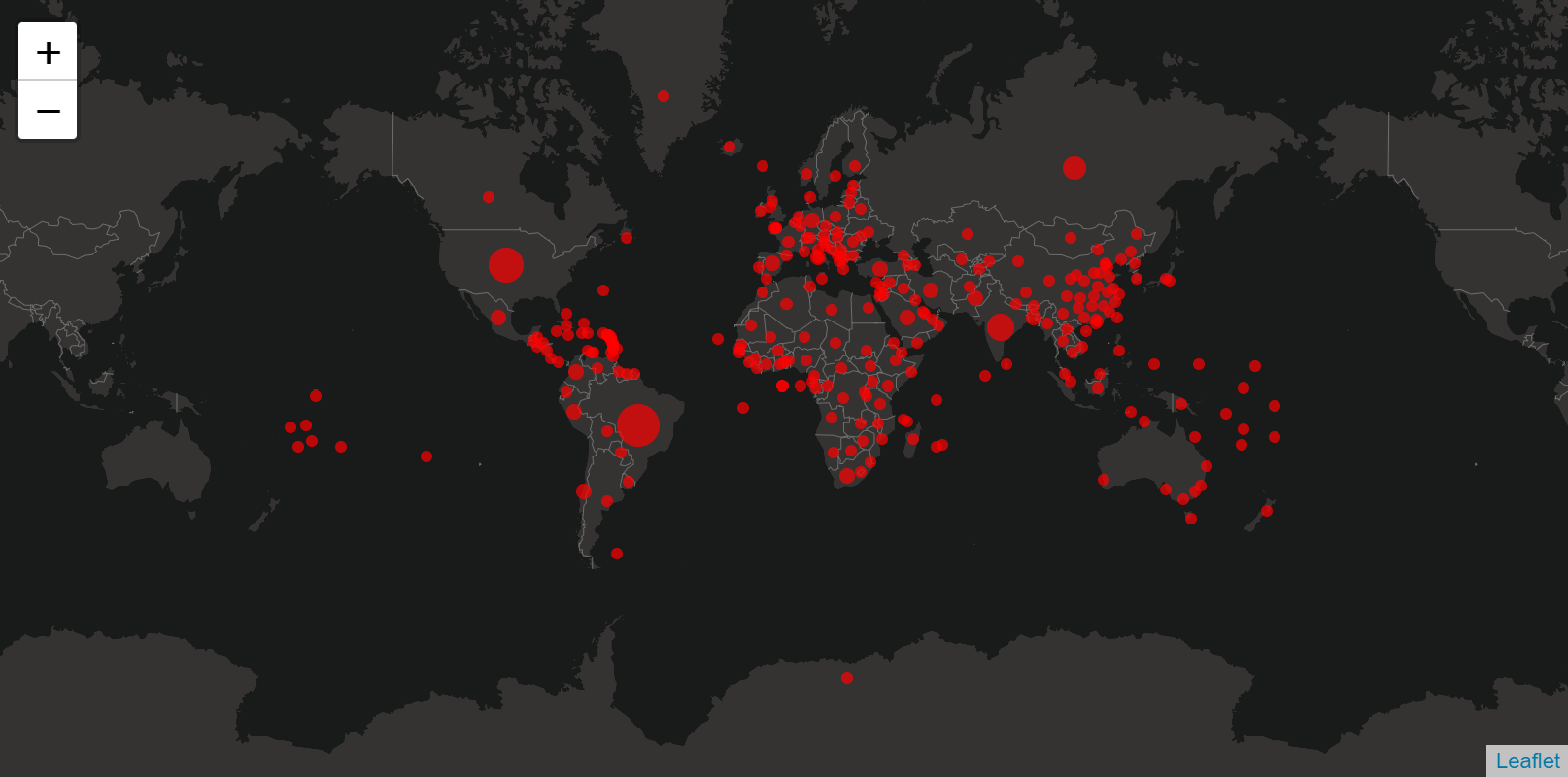
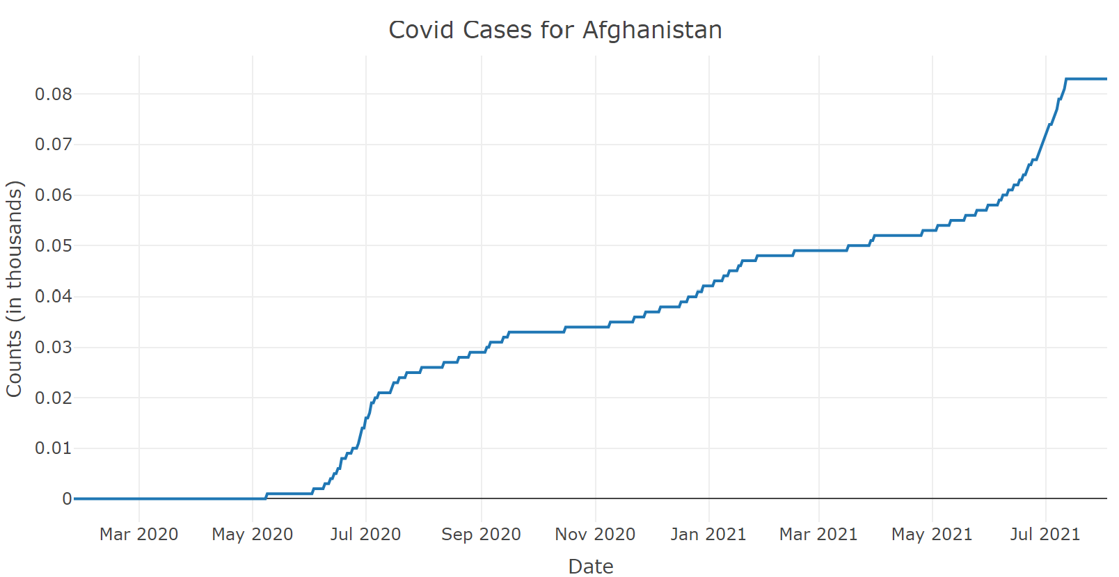
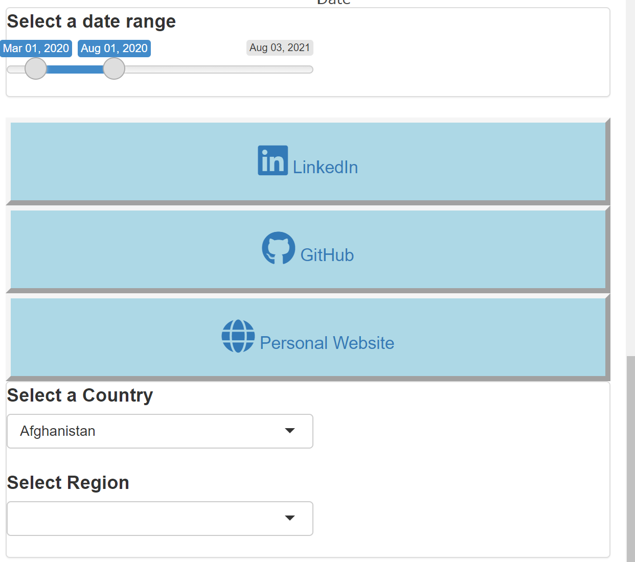
A dashboard containing an interactive map, line-graph, time-slider, region selector was created
for visualizing the covid cases throughout the world.
The data was obtained from the COVID-19 Data Repository by the Center for Systems Science and Engineering (CSSE) at Johns Hopkins University.
It was preprocessed using Tidyverse packages in R and made with R Shiny by combining Leaflet, Plotly outputs.
The Map is a proportional symbol map and has pop-ups showing the country name and and covid cases for the specified time-frame.
The app is hosted live at Shinyapps.io.